- Admin
- #1
from www.istartedsomething.com

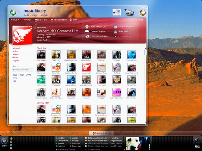
I had never seen this screen before ... parts of it.* It reminds me of all the things that got changed by committee - when they were so cool before..
examples:
- The big back button - and small forward - shows only if needed
* Committee:* Put both on screen - at all times - at same size
- The invisible address bar - helps get rid of rectangle/bar overload
* Committee: Make it visible at all times - even if it make IE look like 12 bars in a row
- The redish - expandable top options bar
** Committee: Make them unexpandable, make them all puke green, make the selected preview*pic un-3d and flat, add yet another bar at the bottom
- Top right preview icons (either open apps, or related - not sure - looked cool though. Also the top menu bar is all one piece
* Committee: make the top bar the same as xp - but make it go black if mazimized, remove the cool graphical icons - add more text to UI
- Show albums as album covers
* Commitee: Put album covers coming out of folders so you can only see half the cover
- Startbar -* it is kind of wacky - but the concept was there: Use a full width panel - not a little flyout / integrate sidebar - make ONE metaphor for controling win UI not 2
*- Committee: put it back like XP, remove all the icons, make text small, remove user name, remove all references to MY computer (as it is now ms's computer
sigh...
More...
View All Our Microsft Related Feeds